MAKING A VECTORED ILLUSTRATION
IN ADOBE ILLUSTRATOR


MAKING CUSTOM BRUSHES IN PHOTOSHOP 101
IN ADOBE ILLUSTRATOR

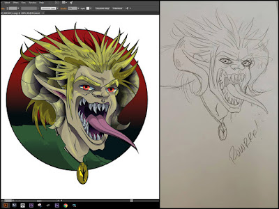
Credit to Dani Smith for the sketch I used from her Black Dog and Rebel Rose comics:
(Opening file in Illustrator)
Let's go ahead and open up our image in Illustrator. First open Illustrator, then go to the top menu bar and click "File". Then scroll down to open, (File>OPEN) There will be a pop-up navigational window where you can choose what file on your hard drive that you wish to use. Once open your window should look something like this. Note* if your menu layout is different, do not worry, I will be going over where to find them.

(Dropping Down the Opacity)
Once your file/ illustration is open, you will want to drop down the opacity of the illustration. Unlike Photoshop, you can not just do this by selecting the layer than changing the opacity. You will need to find the selection tool in the tool bar located on the left or by using short cut key (V) and click on your rendering. If your transparency window is not visible or you can not find it, simply go to your top menu bar click on Window and scroll down to transparency.

(Locking Illustration Layer/ Creating a Line Layer)
Now that your original illustrated layer's opacity is dropped down, you are going to want to lock the layer so that you can not obscure it. If you look closely at the layer window, you will see an eye-like symbol, next to that an empty square. If you click on the empty square, you will notice a lock icon appear; this means your layer is now locked. Locked layers cannot be affected unless unlocked by clicking on the lock. Now that your layer is locked, it is time to create a new layer by clicking on the "Layer" icon located at the bottom right side of your layer window. If you wish to rename the new layer (recommended). Simply double click on the layers name and type in what you want to call it than press enter. I named my new layer LINES.

(USING PEN TOOL)
Time for the creative part of this process: retracing the lines. First step is to select the Pen Tool in the tool bar located on the left side. If you want to use a short cut key, simply press (P). The pen tool does not work like a brush tool that you may be used to in Photoshop, it is a click and drag process. I will go over the basics that you will need in this tutorial, though you might want to read up on it on your own time. There are 3 attributes into creating a line in Illustrator, (Point, Line and Handle). First the Point. When clicking once with the Pen tool on the edge of a shape in your composition, you will notice a dot: that is your point. In this picture below I started on the right side of the eye to create a line. Now make another point by clicking on the other side of the eye. You will quickly realize that you have created a straight line, but this is not what we are looking for. To create a curved line after making your first point on the right side of the eye move your pin tool over to the left side of the eye and click but do not let go. With your right mouse button clicked and held down drag your courser till the line is symmetrical to the line you are tracing, Once you have dun this you will notice handles. The handles appear as two extruding lines from the last point created with two points attached to the ends. Handles are so that you may adjust the line's curve that you have just created. To manipulate the handles you must use the Selection Tool (V) or the direct selection tool (A) located in the tool bar menu on the left side. Selection Tool will modify both handles, as the direct selection tool will only modify one handle at a time. Too close of a shape and you will want to make your way back to the point of origin by clicking on it with the pen tool. Make sure to close off every shape for this will be important when moving to the final process.

(CLEAN UP/ OUTLINE STROKE)
Once you have all your lines complete and closed off you are ready to change the lines into shapes. With the selection tool, click and drag around the entire illustration so it is selected. First thing you want to do as it is selected is to clean up any stray points that you might not be visible, so go to the top menu bar and click "Object", then scroll down to path and in the pop out menu click "Clean Up", located at the bottom. Know you are ready to out line the stroke, With your illustration still selected go to (Object>Path>Outline Stroke). With your lines now outlined you have successfully turned each line into a shape.

(PATHFINDER/UNITE)
Now we have to merge the lines together. We can do this in the Pathfinder window. If you can not find the Pathfinder window go to (Window>Pathfinder) located at the top menu bar. Within the pathfinder window you will see two sub options: One is Shape Modes, the other Pathfinders. We are interested in Shape Modes. Under shape modes click on the Icon Unite.

(OBJECT >COMPOUND PATH> RELEASE)
Now that our lines are shapes and united, we have to release the lines to turn the negative spaces into shapes. We are doing this so that we can select each shape and pick a color or gradient to fill it such as the eyes for example. With the illustration still selected, navigate to the top menu bare, click on Object, Scroll down to compound path and click on release. Now you should end up with something like the image below

(MAKING NEGATIVE SPACE WHERE IT SHOULD BE)
One thing that always seems to be a problem with Logos I get from clients is that negative space where you should be able to see through the logo is actually colored and represented as an object/fill. For this tutorial I have noticed one spot that if not treated early on will cause problems for myself and the client when it goes to print. Notice the red triangle where the hair spikes are. This space should be negative, absent of any form so that the background will show through, for example when I am having this sent to print and the shirt is green I want that space to have nothing there so the shirt color can show through.

\
Hear is how you fix that issue: First, select the outer most shape of the illustration with the direct selection tool. Always select the outline first.

Now that you see the selected outline around your illustration, hold down "Shift" and select the undesired fill.

In your top Menu bar go to "Object", scroll down to compound path and then click on (Make). You should end up with something like this.

(PAT YOURSELF ON THE BACK)
Pat yourself on the back for a first timer! :) This can be quite the changeling to follow along, but I hope I made this easy enough to follow even for the greenest of thumbs. A few more steps and you will finally have the understanding of how to produce an industry-quality vectored illustration. I can not tell you how many of my pears do not know how to do this, by learning this whether your a comic book Illustrator or even a Graff artist, you will be putting yourself 10 times above your competition.
(LOCKING THE BACK GROUND SHAPE)
The background shape is what makes up your outlines and inner lines. Depending on what color you assign, it will also reflect the color of your lines that do not exist anymore because everything you have now are shapes with negative spaces. The negative spaces are interpreted now as your lines. Use your "Direct Selection" tool to once again select your outer most line of your illustration. As you have outer most Line/Shape selected, click on your Selection tool and go to the top menu bar. Click on "Object", scroll down to "Arrange", and click on "send to back". Once you have done this you are going to want to lock it by going to Object> Lock Selection or simply using the hot key CTRL+2.

(MAKING YOUR ILLUSTRATION VISIBLE TO COLOR)
Now that your background shape is locked it is time to have your illustration show its pretty face. Take your "Direct Selection" tool and drag from upper right to bottom left and select your full illustration. You will notice everything but your background shape is now selected.

Now with your inner shapes selected, change your foreground color to white. Now you're going to get something like this. But you might ask why am I left with some black shapes and some white shapes. This is due to the order of your shapes that lay in the layer. No reason to freak out! Simply take your Direct Selection tool and as you hold down shift Select all the shapes that you have that appear black. After you have all selected, change there foreground color to white and make sure that you go to object located at top menu bar scroll down to Arrange and then click on "Bring to Front".

(MISSING SHAPES)
You may find out that you have some missing artifacts in your illustration such as I do with my left eye and other small parts. HAVE NO FEAR! We can fix this fast. There are two different views you can analyze your project with, (OUTLINE) and (PREVIEW ON CPU). You can find these two options at the top menu bar under (VIEW). For this step you want to temperately view your project in (OUTLINE) mode, so that you can visibly see all the shapes that do not appear when viewing your project in (PREVIEW ON CPU) mode.
(PREVIEW ON CPU)

(OUTLINE)

(CHANGING MISSING ARTIFACTS)
As you can see, I have used the Direct Selection tool, as I hold down shift to select each missing artifact. If we look at our foreground color we will notice it is white. This is not what we are going for; we want the foreground color to be black. In order to change the foreground color to black, with the missing artifacts still selected, we want to go back to (PREVIEW ON CPU) mode. Double clicking on the foreground color icon and manually change it to black by using our curser to drag the color picker to the bottom left will fix the issue. SEE BELOW.
(SELECTING)

(CHANGING COLOR)
You may have to go back and forth with object arrangements, such as "bring to front" and "send to back", but in the end as long as your foreground color is black for lines and objects that should appear so, it is just a matter of layering on top of each other and stacking in the right order.

Now it is time for color! This is what you all have been waiting for!! With your "Direct Selection" tool selected, click on a shape and double click on your foreground color to chose the color desired.

(BASIC COLORS)
Once you have your basic colors, now it is time for a real trick of a trade: Blending Modes!!!
There are two Blending Modes that are very important for intermediate Illustrators, "OVERLAY" and "MULTIPLY". I will use my pin tool to create shapes that fits the purpose of my design. "MULTIPLY" is a shadow effect, "OVERLAY is a highlight effect". Depending on the look you are going for, is hand in hand with the color you pic, Never use black or white this will droned out your plait. This is color theory and we can cover it in another tutorial, you can find your blending moods In the window drop drop down menu and selecting Transparency. It is equally important to change your opacity in each blending mode as it is to change from overlay to multiply.
After reading through the tutorial, you should understand that shapes are created with the Pen Tool so when creating shadows I use the Pen Tool to achieve the desired effect and shape.
(WITH BASIC COLOR)

(WITH BLENDING MODES)
Like every artist that came before me, we do not give up our techniques easily, but I am a sucker for helping out my friends so the next steps will be shown but you as the reader will have to analyze them.


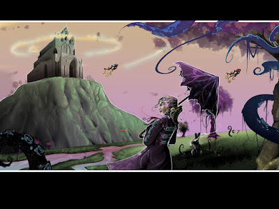
And this is what I ended up with:

MAKING CUSTOM BRUSHES IN PHOTOSHOP 101

Intro
One of the most common questions I run across from Photoshop enthusiasts is how to make custom bushes. Custom brushes are a way to bring style and originality to your digital rendering. Some brushes can imitate graphic textures, while others can give a digital painting a more realistic appearance. In this tutorial, I will go over how to create a custom brush, and describe in detail things you can do that will help give your rendering a cutting edge when using a pressure sensitive tablet, such as a WACOM.
Creating A File For Your Brush:
First step is to create a new file. If you plan on sharing this file with a friend, you will want to name your file and save it in a organized fashion on your hard drive. depending on your computer you can ether make this a large file or a small file, Just remember if you do not have a very powerful computer you might not want to make it too large, due to lag time in the brush after making it.
for this example I will be using a two inch by two inch file, (1200 X 1200 Pixels) with a 250 DPI, (Resolution) As far as the color mode, normally for Photoshop I stick to (RGB).

Creating Your Custom Brush
Now the fun part: creating your Costume brush shape! Possibilities are endless. For this tutorial we will just stick to the basics, though I do recommend experimentation to fit the look and feel of your digital rendering. Below you will see that I have just created small circles bunched up together. By using different sizes I can create interesting imperfections with the brush tool. My foreground color is set at black.

Define Brush Presets
Once you are satisfied with the overall shape of your brush, the next step will be to select what you have made. You may use the short cut keys (CTRL + A) or go to select at the top menu bar and under the drop down menu click (select all). Once you have the shape selected you will need to add it to your brush library by defining it as a brush, You can find this preset at the top menu bar under the edit drop down menu. Find and select (Define brush presets). A pop out window will appear where it will ask you to name your brush. Once you name your brush (recommended), click OK.

(Example) Without Adjusting Presets:
What you have so far will look like this, not much of a brush if you ask me.

Brush Presets
By default your new custom brush will appear at the bottom of your brush Presets window. If you do not already have your (brush Presets) window open, got to the top menu bar under the window drop down menu and select brush Presets. Once open use the side scroll bar to scroll to the bottom of the brush list and select your new custom brush. Another way to find your custom brush is to go to your tool bar, select your paint brush tool, and right click anywhere in your composition. Again, it will be located at the bottom of the list.

Brush Window
All right! You are almost there. Now all you have to do is adjust a few settings to make it work properly with your tablet. make sure your brush window is open. If your brush window is not open, got to the top menu bare and under window and select Brush.
There are many options in the brush Menu, all should be experimented with at some point. For this tutorial we are going to go over two important presets, Shape Dynamics and Transfer. When clicking on any of the presets in the Brush window, you will notice on the right side of the window presets that you can modify for each selection such as transfer and Shape Dynamics.
Shape Dynamics/ Size Jitter
After clicking on shape dynamics you are going to set your size Jitter to Pen Pressure in the control option. This will allow you yo make a thick to thin line with the pressure you apply to your tablet. *Note* ( If you see a warning mark next to control with an exclamation mark that means you need to down load your driver for your tablet. If using a PC this also means restarting your computer.)
Shape Dynamics/ Angle Jitter
Having shape dynamics selected on the right side of the menu also set your Angle jitter to to 50% with the slider bar, or clicking on the 0% and typing 50% This will give your brush a more natural and realistic appearance by rotating the brush pattern you have made as you are illustrate with it. At the bottom left side of the the brush menu, you will see what your brush stroke will look like when applied to your composition.

Transfer/ Opacity Jitter
Once you are finished with the steps in shape Dynamics it is time to move onto Opacity Jitter located in the Transfer options. In the control option under the Opacity Jitter, select pin pressure. This will allow you to manipulate the opacity of the stroke depending upon the pressure you apply to your tablet. In the the box on the bottom right of the window, you will notice the example stroke fade on ether side of the tapered line.
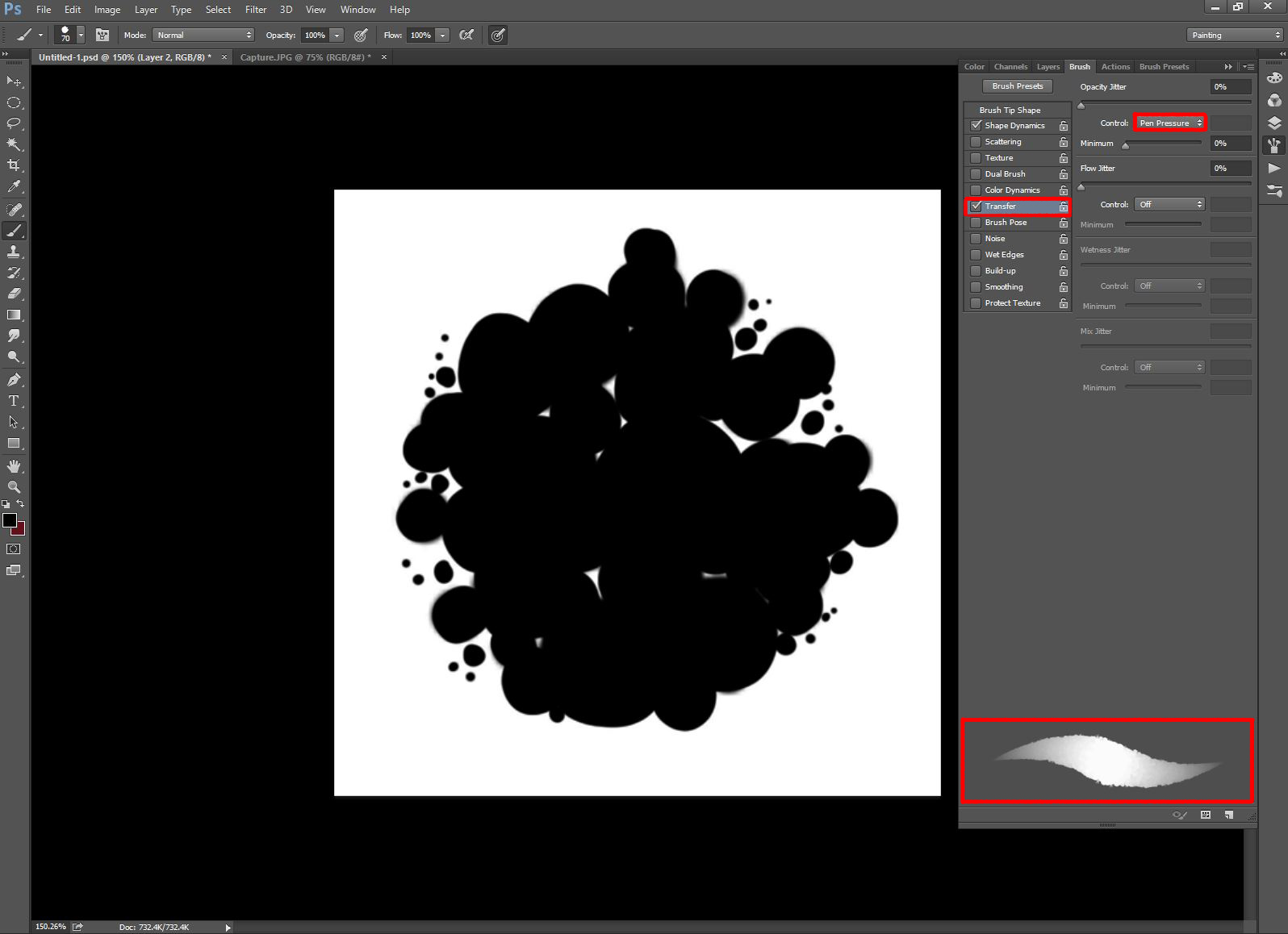
Brush Tip Shape
The final preset you will adjust for this tutorial for this costume is located in the Brush Tip Shape presets. Select Brush Tip shapes than go down to the bottom of the presets and change the spacing to 1%; this will give your brush a nice rich stroke without the gaps in-between your brush pattern.

(****IMPORTANT****)
Saving Your Brush Presets
Even though your Custom Brush is saved, the presets are not. Once you close your file or change a brush and its presets, all the tweaks you have just made will disappear and you will have to redo all the settings unless you save what you have just created. Located in your brush window at the very bottom you will see a small icon that looks like a layer icon. Click on the icon and give it a different name from what you named your custom brush. And there you go...the 101 quick course of how to make a brush in Photoshop! I encourage for you to always experiment with presets and adjustments, as that is the best way to learn.

Example of stroke that you just made.

No comments:
Post a Comment